It’s hard to beat a clever use of negative space in logo design. Here are 35 or so logos that use white space well, along with the designers/agencies responsible.
Sometimes all it takes is a creative team, with a new set of eyes to help bring your logo to life!

A.G. Low Construction logo
By Rebecca Low
Martin Newcombe Property Maintenance logo
By buddy

Nexcite logo
By Amore
Via Blair Thomson

American Institute of Architects Center logo
By Pentagram

Ogden Plumbing logo
By Astuteo

WWF
By Sir Peter Scott, modified by Landor

FreemanWhite logo
By Malcolm Grear Designers

The Brand Union logo
By The Brand Union
Egg n Spoon logo (same day couriers)
By Thoughtful
Human logo
By Social UK

Dolphin House logo
By Ico Design
Eaton logo
By Lippincott (thanks, Brendan)
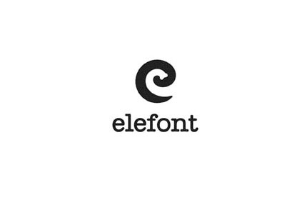
Elefont logo
By Logo Motive Designs
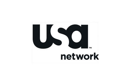
USA Network logo
By Sean Serio

CultureBus logo
By Pentagram

Carrefour logo
Original design examined by Miles Newlyn (thanks Rianna)

Henri Ehrhart monogram (shameless)
View the design process on David Airey dot com

Sinkit logo
By smashLAB

Guild of Food Writers logo
By 300million

ED logo
By Gianni Bortolotti
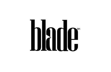
Blade logo
By Subversive Design

Premier Catering logo
By Madhouse
Via Logolog

The Waterways Trust logo
By Pentagram
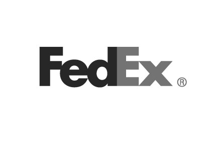
FedEx logo
By Lindon Leader while at Landor

Knoll logo
By NB: Studio
Via Logolog

Ryan Biggs Associates logo
By id29

Hartford Whalers logo
By Cummings & Good (thanks, Jeff)

Conception logo
By The Chase

Yoga Australia logo
By Roy Smith Design

Hands On Network logo
By Duffy & Partners

MyFonts logo
By Underware

Vanderbilt University logo
By Malcolm Grear Designers

Recycle Taiwan logo
By do you know?

NBC logo
By Steff Geissbuhler while at Chermayeff & Geismar

New Bedford Whaling Museum logo
By Malcolm Grear Designers
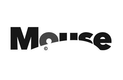
Mouse logo
By Johnson Banks
- Log in to post comments